Challenge Goals
As the senior designer for this project I worked with key stakeholders: Mentor Buddies founder Grace Ling, and the Mentor Buddies product director, directly to develop a new onboarding process for Mentor Buddies, reducing drop off rates and increasing the number of users who connect to a mentor and chat!
Mentor Buddies wanted to improve upon their onboarding process for new users seeking to chat with a mentor, motivating new users to start their first session. The current process saw high drop of rates in a few key stages.

Grace’s Goal: Increase Conversion Rate
I interviewed Grace Ling, the founder of Design Buddies and Mentor Buddies, to learn more about the current solution, and some of the things that were working (and not working) in the Mentor Buddies beta launch.
What needs to be improved?
Hard to tell what field mentors are in
People open the app but then don’t sign up and start a chat
What’s Working?
Chat itself is working well
Mentees are able to connect with their mentor on a personal level
Mentors have a good time, feel like the mentees to research before hand and ask non-googleable questions

User Interviews
I conducted several interviews with some existing Design Buddies members, to see how they reacted to the beta launch’s onboarding process. They felt…
The onboarding criteria was not specific or complete.
They did not understand why they had to create an account.
They did not feel that their mentor matches were accurate or personal.
Main takeaway: we need to create more trust with our users

App Analytics
I analyzed these user interviews and Mentor Buddies App Analytics to identify key points of friction. Throughout the onboarding experience there were significant drop off rates, I analyzed percentages as well as time spent on screens to get a better understanding of users pain points.
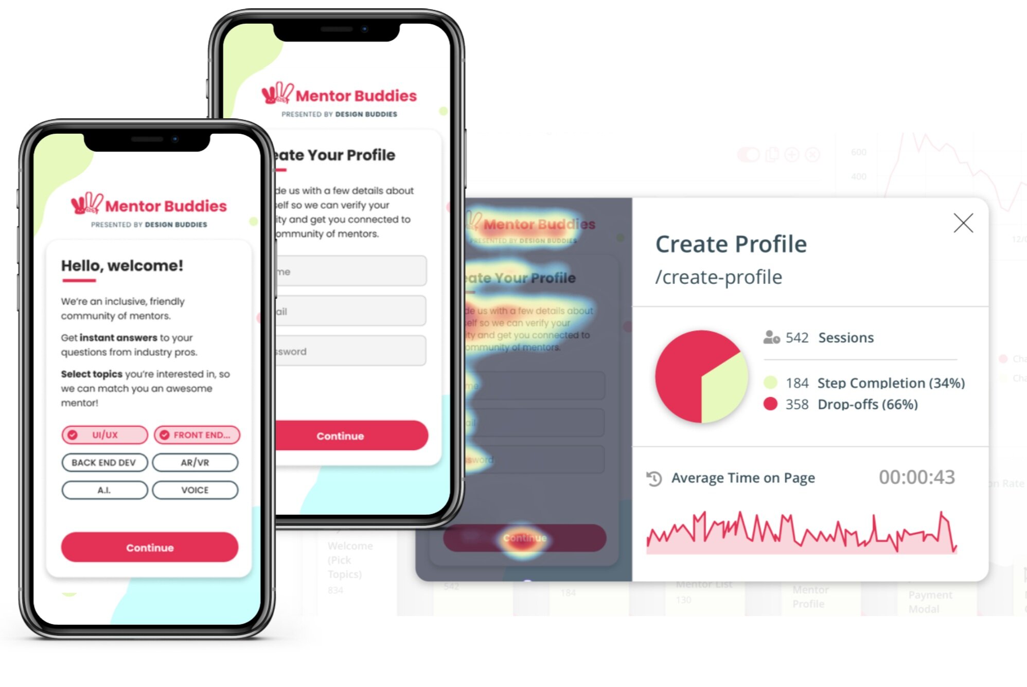
Welcome & Account Creation
We see a peak drop off at the account registration wall of 66%. I learned from my research that this single-screen welcome experience is not targeted enough and users leave because they do not see topics that relate to them. Users at this stage are skeptical and distrustful of the onboarding process, they are not invested enough to provide their personal information.
Based on these findings, I recommend expanding the list of topics, and creating more specific areas of interest within each, will help users trust they are getting matched closely within their interests.
We can compound the effect for the more targeted welcome experience, by previewing their results prior to registration, as well as incorporating UX writing to bring the user into understanding the need for account creation.

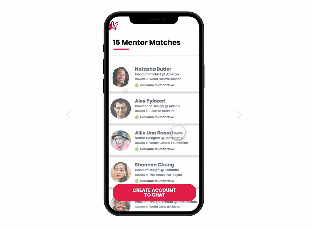
Mentor Matches
Later we see a particularly high drop off when users get to the Mentor List Results. Additionally they are spending a very long time on this page, 5 min, and as we can see from the heat map they are all over the place. I learned from user research that users are overwhelmed by the long list and are unclear why they have matched with these mentors
Based on this research I recommend including the match criteria in the mentor profile preview, and shortening the list of results to just the top 10-20 matches.

Solution Development
While there were medium to high drop of rates at a few points in the process, analysing them in combination with user research lead me to focus on two key areas: The Welcome screen, and the Create Account screen.
How might we design an onboarding experience that new users trust and encourages them to start their first mentor session?

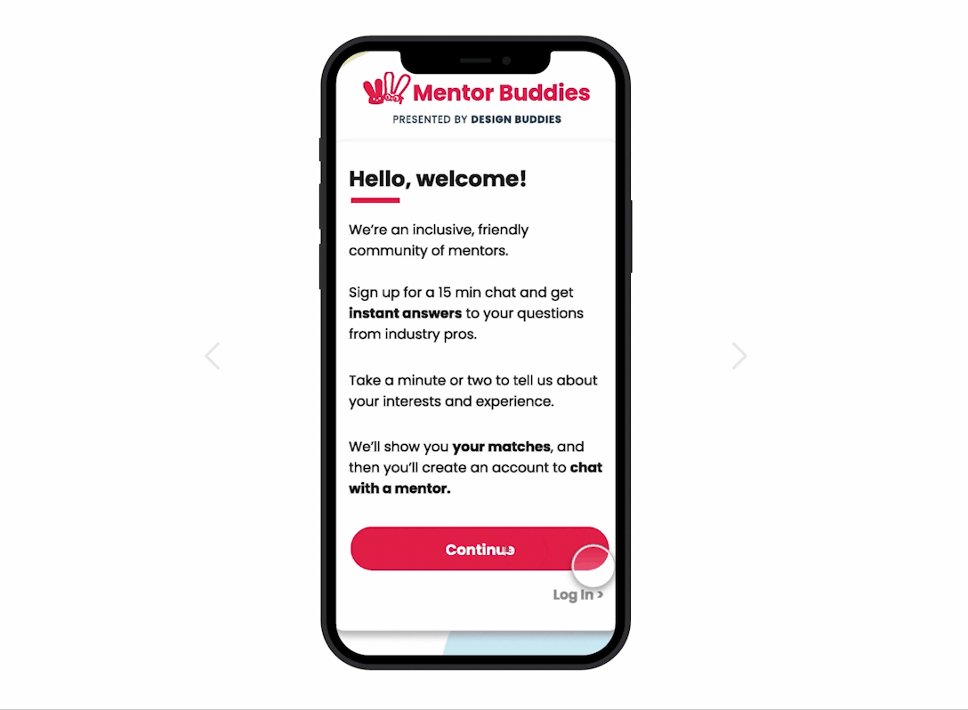
Welcome (before)
There is a high user drop off after the Welcome screen because users don’t believe they will get good matches based on the very limited information they are asked to provide.
This single screen welcome experience lacks the specificity we need to garner trust with our users, creating a 66% drop off at this point

Sketching Solutions
I sketched out some options to create a clearer welcome process, from setting up the users expectations of what they would get from this onboarding (progress indication), to making the list of interest and experience opics more detailed, and increasing user’s confidence.
Welcome Flow Redesign
To address this point of friction, I decided to expand this screen to a 3 screen flow, emphasizing asking better questions and offering more specific and complete information to the user. Based on the user feedback that these selections were too limited, we believe it will work well to make users more confident in the quality of their matches.

How can we amplify the results of this new, targeted experience for users, creating trust before they need to create an account?

Account Creation and Mentor Results (before)
After an overly simple welcome experience, the immediate need for account creation, without explanation, created another 66% drop off at this point, leaving us with almost no users moving forward.
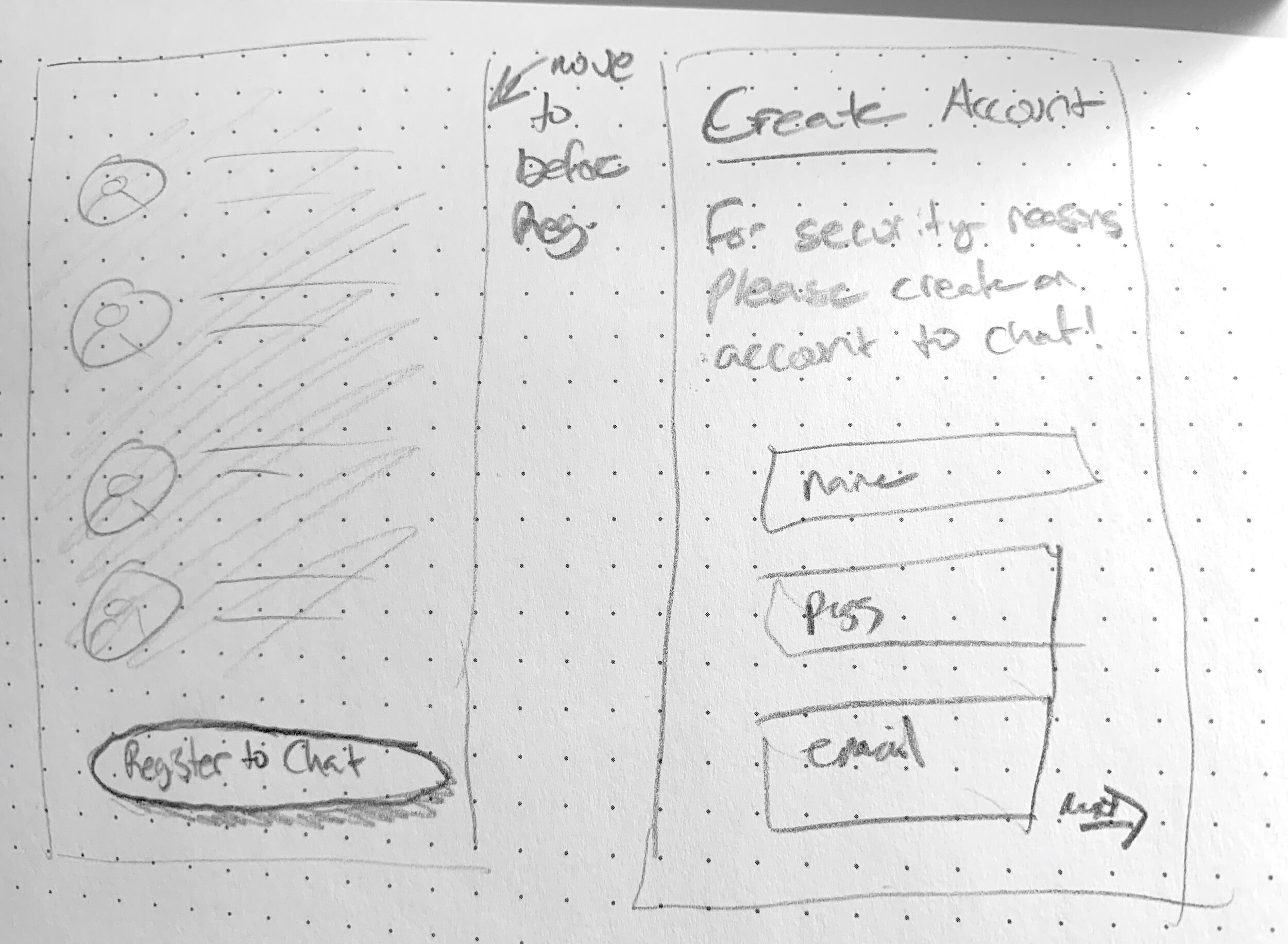
Sketching Solutions
I sketched out some solutions including reorganizing the flow to tease the user with their mentor matches before asking them to create an account. I also considered the importance of bringing the user into the decision making process and understanding why they needed to register.

Account Creation Redesign
To address the point of friction and high drop off at Account Creation, we decided to show users available matches before asking them to sign up, and telling them why we needed their information.
Based on the feedback that users didn’t know why they had to sign up, we believe it will work well to make users more confident in creating accounts.


Results
By addressing drop off rates early in the onboarding process through expansion of the welcome screen, we were simultaneously able to reduce drop off later in the Mentor Matches: by providing a more targeted list of mentors.
We’ll measure success by increased conversion through the onboarding flow over all, and a decrease in drop off on these key screens we’ve identified.
The next steps are to release the new flow to select, random, new users, and analyze the change in conversion rate. Simultaneously, user interviews on the new flow are giving us insight into how the new flow has increased trust in matches.