Digital Event Platform for A Global Town Hall
The Bloomberg New Economy Forum needed to quickly pivot to a digital event in 2020, but with an older and extremely VIP audience, adoption and usability were major concerns. They needed an intuitive platform, designed for English and Mandarin and working in China, with billionaire stakeholders, where the world's VIPs from over 35 countries could come together to discuss the future of global finance and trade, cities, climate and health, over 4 jam packed days of 24 hour content.

Challenge Goals
Create an intuitive platform to showcase the incredible content of the Bloomberg New Economy Forum over its 4 days, generate interest, and bridge the gap to the next in person forum.
As the front end product lead, I had 8 weeks to work with Bloomberg’s stakeholders to design a completely bespoke, responsive, online event platform, in English and Mandarin, and able to work in China. Integrating VMeet technology, for a high end, seamless event experience for the most influential changemakers in the world logging in from over 35 countries.
How might we take all those small moments that make a conference special, and bring them into an intuitive digital space?
Competitive Analysis
Zoom and Intrado dominate the digital events space. Our client wanted a more cohesive experience for their audience who would be engaging with 24 hour content over 4 days. Analysis was better from social networks than virtual meeting platforms.
Initial Research
Finding test users who closely resembled the target audience was the first challenge, but I was able to interview environmental startup founders, broadcast company executives, executive administrators, climate scientists, financial executives, and philanthropists, giving me great perspective into the mind of our audience in the initial research phase, and then later in mockup testing. I found they wanted to replicate chance encounters from a live experience: “birds of a feather” room, social hours, “bumping into others”. I also found them to be surprisingly digital savvy, confronting my own bias.

User Journey
Keeping the 4 key components of the platform close at hand was essential to stakeholders. Developing user journeys helped us keep paths to any corner of the platform short, making it intuitive and clear through and through

Architecture
I began with card-sorting sessions to develop a site architecture that resonated with stakeholders. This platform features 4 key components: Schedule, Directory, Main Stage and Breakouts and keeping those at the forefront was vital.

Creative Development
We underwent several creative rounds before arriving on a design theme that resonated with the team. I worked closely with the executives to understand their directions and desires, marry those with the needs of our users, and bring them to fruition.
The platform was built on existing Eventfinity platform technology, which presented a variety of constraints, but also gave us the ability to build incredibly robust features on an extremely short timeline.

Sketches
The landing/home experience was essential to guiding users where they needed to be quickly and easily. Sketches of the main page designs helped stakeholders work out the importance of the hierarchy and allowed me to rapidly iterate before introducing creative elements.

Wireframes
With working, clickable, wireframes stakeholders were able to focus on the structure of the website, information architecture, and content before introducing flashy and distracting brand elements.
User Interviews
In each round of the process it was vital that I test with real users to understand if this platform met their needs and fostered engagement. Their insights helped me focus my efforts and protect their interests. I analyzed these user interviews to help the executive team understand the goals of our platform and how to meet them. Many of the final features came purely from learnings in my user interviews.
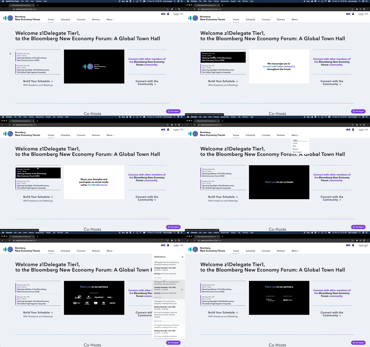
Key content previewed form the home, not just a landing page, but important content was available and easy to access, driving traffic right where we wanted it: on the sessions!
1-1 meetings, users craved that moment when they bumped into people after sessions and felt the 1-1 meeting was an equitable way to recreate that experience online
Personalization: the welcome message and schedule previews tell users that this is their personal account and encourages them to explore and engage.

Concept 1
“Black and Sleek” was the initial brief, so I pulled elements from the brand toolkit that supported a sleek, innovative feel.

Concept 2
“Cutting edge native app” was another stakeholder desire so I pulled elements from the brand toolkit to make a design system that would give delegates a black tie level experience.

Concept 3
The final concept reigned in the initial rounds to a straightforward and clear design system.

The Final Product
“Black and Sleek” was the main desire from my stakeholders, but I found in my research that this audience struggled with “darkmode” readability. I turned our final round into a white design, keeping it approachable and familiar and also easing accessibility concerns. This design system was then translated out into show graphics and reminder emails.
The 3 CTA’s above the fold direct participants to the most vital parts of the platform, and where we wanted to keep traffic.

Home
This Platform was function heavy, every element was interactive and communicating that depth to the user was imperative. From the home users we able to view the broadcast in a mini player, scan their schedule and join agenda items, receive notifications of event wide communications and adjust their profile.

Main Stage
A full screen media player keeps the focus on the forum's groundbreaking content, below the fold features live polls, Q&A, and session information including quick links to speakers profiles.

Schedule
Each participant's custom schedule gave quick informational previews, highlighting the speakers. A click into each session revealed detailed descriptions. Participants could also register for breakout sessions.

Connect
Through the fully searchable directory, participants were able to find and learn more about each other as well as schedule 1-1 meetings to continue conversation about these important topics that affect us all.

Results
The online platform was so successful, the Bloomberg New Economy Forum wants to keep this digital component as a feature going forward. Many participants remarked that this platform and the growth in virtual presence technology could end the “round the world flight for the two hour meeting” and applauded the change and its impact.
Incredible adoption rate: the participants found the platform intuitive and easy to use, they easily connected with each other and we saw great participation in session content.
Testimonials from the team:
“Beautiful design that is so intuitive, my mother could use it.”
“You're a true, true pro. So thankful for your work on this platform, your user centricity [and] your patience”
“[You] delivered smart, empathetic and thoughtful UX work for the duration and I really loved the results.”
“I can't thank you enough for navigating this with us, … we are so pleased.”


